Let’s add a quick visualization or two to this data to be able to understand it a bit better.
Delfini’s visualization features are designed to provide users with instant, easy-to-build charts that are seen directly alongside their data. In order to minimize complexity, we offer a limited subset of chart types and configuration options. For more advanced visualization use cases, consider integrating Delfini with tools such as Shiny or Jupyter.
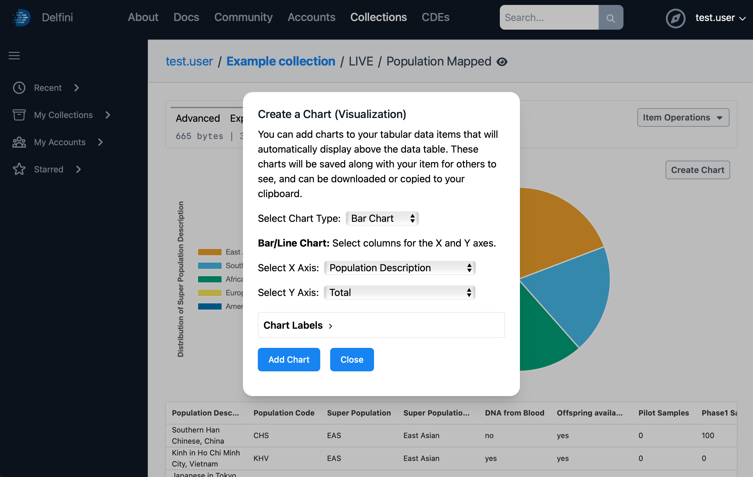
If you aren’t already there, scroll to the top of the screen and click the Table tab. Then, click Create Chart to open the Create a Chart dialog. Choose the Pie Chart type, and choose Super Population Description as the desired axis. Then, click Add Chart.


You can add a second chart by clicking Create Chart again, choosing the Bar Chart type, with the X axis as Population Description and Y axis as Total. Then, click Add Chart.
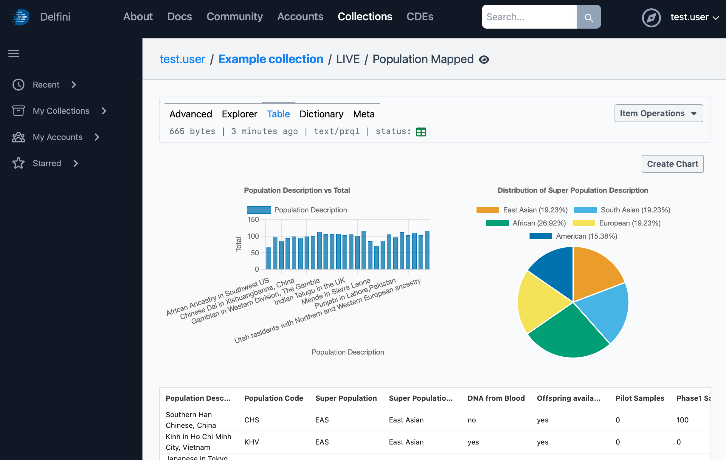
These charts can be edited, dragged to change their order, and exported for use in presentations and other materials. They will remain attached to this data item and will be visible for any other user who can view the data.
Previous: Data Transformation - Next: CDEs and Data Elements